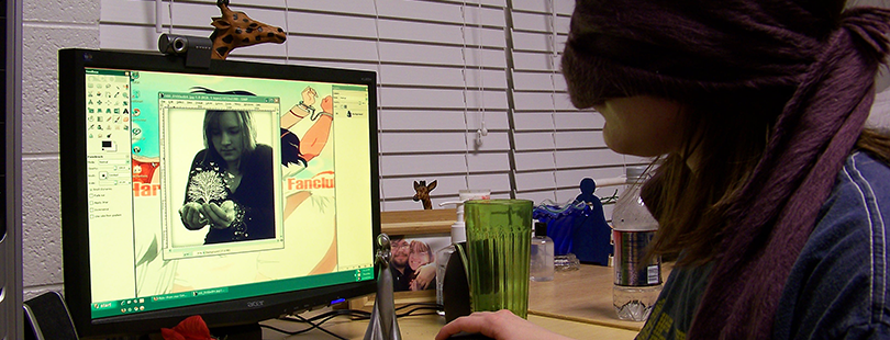
What I Learnt from being Blind for 24 Hours
After having been pretending to be blind and trying to browse the Web for about 24 hours, I can't even begin to explain how important web accessibility is. It is a whole new world relying on screen readers to extract the information present on a web page. It is also a realization of how much most of us, sighted users, take vision for granted. Animated text, graphics, pictures, visual representation of information - we, at least me, have made it our first priority to make our websites look "pretty". It's not that we don't care about people with vision impairment; I believe it's our lack of knowledge that has, over time, made us to not include web accessibility as a core component of our websites/webapps. Gladly, things are changing.
Here's what I learnt pretending to be blind:
Heading structure matters
One of the very basic standards of W3C, which I didn't think mattered at all. I styled my heading elements and then used them based on how they looked on the page. Wrong. Walei Sabry, a New York based accessibility consultant, recently pointed out that most blind users navigate pages by headings, which not only makes the structure important (H1 followed by H2 for subheadings and so on..) but also the content of the headings an integral part of the web page. I had conveniently put "Read more" as the first heading on the web page. What a rookie mistake.
"Read more" doesn't help
While researching different ways to browse a web page, I stumbled upon the Links section, which displays all the links on a page. Imagine having 20 "read more" or "learn more" or "click here" links on a web page. This gives absolutely no information. It's similar to our mistrust in the links in the spam emails we receive everyday. Even if we know the email is from a credible source, chances are that a link with a better text would get more clicks.
"Title" attribute is a myth
I, personally, love "read more" buttons/links. But I also understand that it's not a good way to go about accessibility on web pages. So, I came up with a genius plan to use a "read more" link with a more descriptive title attribute and crossed my fingers for the screen readers to use the title rather than the "read more" text. Doesn't work.
ARIA tags are very very very important
We all love modern jQuery tools on our sites. Tools like tooltips, expand and collapse divs, etc. have always looked cool but are they accessible to blind people? Yes, through ARIA tags. They can be used to tweak your web pages to the extent that you can choose what to show and hide from the screen readers. Excellent way to hide duplicate links, headings, advertisements (well...), redundant text, etc.
Cross-Browser testing is mandatory
Always always always check the web site across multiple browsers. Screen readers tend to differ in behavior. I used Mac's voiceover and found Safari to be the best option. Firefox kept giving me "HTML content is empty" and wouldn't read any of my web pages. I digged a little on this issue and found that Firefox's been having this issue for quite some time. For those of you who would like to test Firefox more on this, Firefox Nightly Build is an excellent option.
Don't forget the "Skip to main content" link
If you have a long (or even a short) navigation bar at the start of your page, you should consider putting a "skip to main content" link at the beginning so the users can skip the long list of menu options. Gets really annoying if you want to browse multiple pages of the site and each one has the same list of menu items that you just HAVE to listen to.
Without "alt" tag, images mean nothing
As my good friend James Tyack often says: A picture doesn't always tell a thousand words. Take Facebook for example. Your home feed is full of pictures. If the caption in your picture says "LOL", there's not much a blind person can get out of it. This is why an "alt" tag is so important. It describes your picture. It gives it meaning.
Patience is the key!
I have very limited hand function and am paralyzed from neck down. My patience, which is much better than most people I know, collapsed while using a screen reader during these 24 hours. Wanted to punch my Macbook (good I don't have hand function for that). It's super annoying to have to listen to that screen reader voice. REALLY annoying. Even more frustrating when the page is not accessible. I can't even begin to explain how it would be for a person who does it on a daily basis. Their patience is out of this world and inspires me so much. Special shoutout to Austin Seraphin, a member of our Unlock Philly team, is blind by birth and an iOS app developer.
My research here at EvoXLabs continues. Much more to come. It's time to level the playing field.
Created: 16 January, 2015


Disqus Comments